
Picture Book: Painting Process & Technique
My Painting Process & Technique for Illustrating a Picture Book.
In this post, I’ll walk you through my process from concept to final for one illustration. The finals are all hand-painted. I’m a Fine Artist at heart, so having a finished piece to hang on the wall warms my heart!
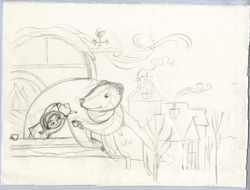
Step 01: Pencil Sketches
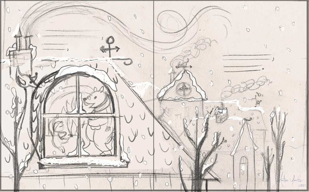
POINT 02: Cleaned up sketch
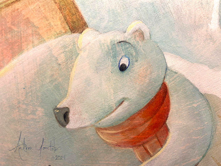
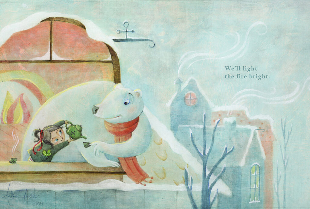
My first sketches are rough, but once I like an idea, I grab a new piece of paper and sketch it in a few different orientations (ie. landscape, square, portrait) to decide the best composition for the story I’m telling. In this sketch with the girl pouring tea for the Polar Bear, I wanted to include a clear view of the buildings in the background so you could get a contrast of the cold, snowy environment with the warmth of their fireplace.
POINT 01: Sketch like no one is watching
I grab a cup of coffee (I love coffee!) and sit on my couch with my sketchbook, pencil, and eraser…and brainstorm! Whether I’m doing a storyboard or a new piece for my portfolio, I still start with this step. I stay super loose so I don’t get caught up in the details, which is very easy for me to do.
POINT 03: Mish Mosh on the computer
Once I have a cleaned-up sketch that I like, I scan it into Photoshop and play with any scaling or placement. I think about the practical aspects such as leaving room for the gutter, bleed, and leaving enough room for text. I find these kind of adjustments much easier to do in the computer. Once these aspects are accounted for, I move on to the value study.
Step 02: Value Study
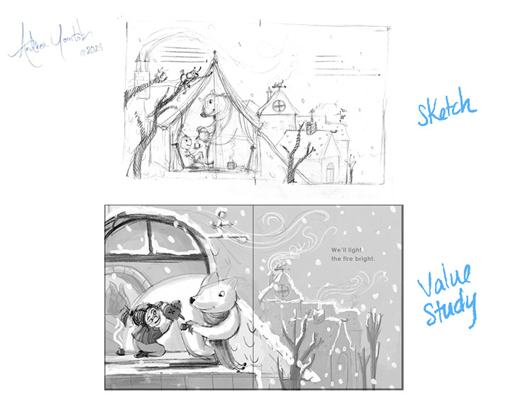
POINT 01: Photoshop
Playing with value on the computer is the most efficient way for me to think through my options. The best part is reducing the image size to a postage stamp to see how it reads. I can also separate my medium and dark values into separate layers, so it’s easier to adjust them.
POINT 02: Revisit Scale and Details
When assessing value, it becomes clear where I need to simplify my drawing and shapes in order for my image to read as clearly as possible. I’ll often do these rough fixes in Photoshop.
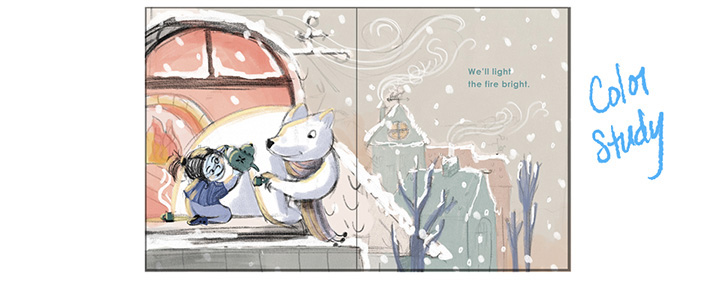
Step 03: Color Study
POINT 01: Choosing A Color Palette
I love to mix colors to inspire me. In this case, it’s a winter scene, so I played a lot with blues and pale warms. There are many directions to go, so I cherry-pick what appeals to my tastes and what I feel works best for the story.
POINT 02: Color Play!
Once I’ve played with watercolors and selected a color palette, I further explore color in Photoshop. This way, I can be more efficient about adjusting colors and toggle on and off my value study as I work.
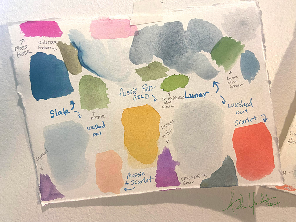
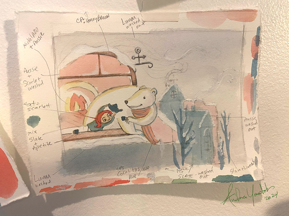
POINT 03: Match Computer Colors to actual Watercolor
Once I am happy with my color mock-up on the computer, I print it out at a reduced size onto watercolor paper. This way I can paint myself a mini “color map.” This helps me plan which watercolors I’m going to use for each area of the painting. You can see an example in the picture below. This is very helpful when I’m painting to use as a road map.
POINT 04: Prep Board
I prefer to choose an overall color to texture my board with. I select this color based on the color palette. In this case, it was white with Bright Aqua green.
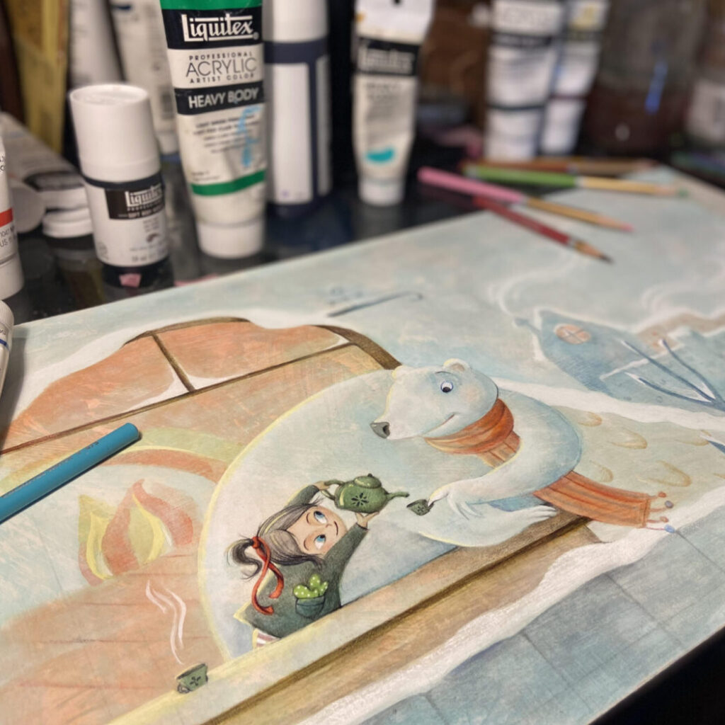
Step 04: Paint!
POINT 01: Prep Board
I prep my watercolor paper (Arches) with custom textures. Once that is dry, I mark the dimensions to match the exact spread size, including bleed size. I use a very light pencil mark in the corners and the gutter so that I don’t have lines running across my page.
POINT 02: Transfer Drawing
I print out my drawing onto printer paper from my computer so that it is large enough to trace over. I use a watercolor pencil (HB) on the back side of the printout in the areas I need to trace. I then tape down the drawing to the prepped board and trace with a Zebra pen. I press just hard enough to see the image appear on the watercolor paper.
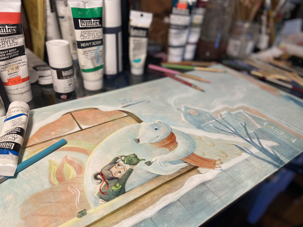
POINT 03: Water Color!
The fun part!! I paint with watercolor using my “color map” as a reference. I usually tape it on the wall above my workspace so I can easily glance up to see it as I work. I will make adjustments as I go, depending on what the color is doing on the page. I often find this the most magical, because so many pleasant surprises happen between the texture and paint. I enjoy seeing it come together while also adjusting my plans for color and value as it unfolds.
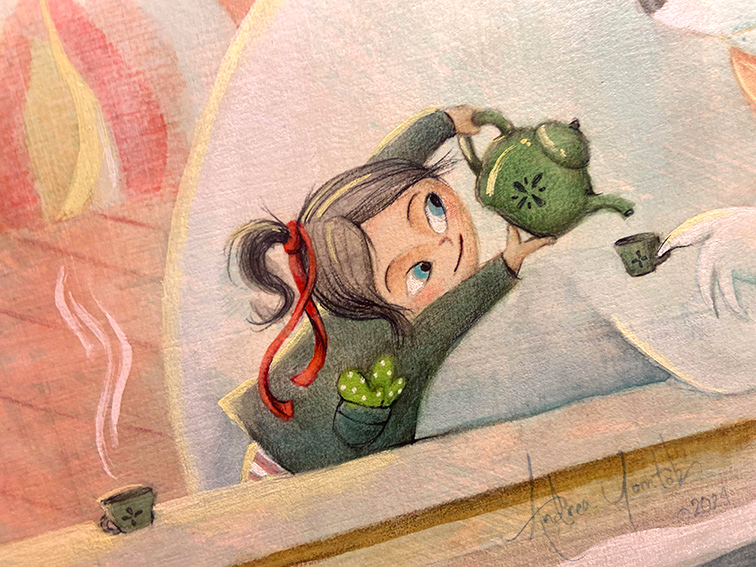
POINT 04: Details & Mixed Media
I like adding details using Prisma, ink, and acrylic. There is an order in which I use these materials due to how the materials interact with each other. For instance, I use Prisma on top of the watercolor because of the smooth result, whereas Prisma on top of acrylic has a rougher finish.
To see more of my process on other illustrations, you can check out my videos HERE, which are also on my YOUTUBE channel @ArtGrowStudios.